Create a SaaS application for county and municipal level tax assessor and appraiser offices to manage properties and their taxation.
Client
Confidential
My Role
Upon joining I discovered that I had inherited a design system and a large number of low-fi Axure wireframes from a previous UI/UX contractor. There were a number of areas that needed improvement as they provided a poor user experience. This page outlines the testing and modifications made to a notes section for parcels.
I was responsible for user discovery and requirements synthesis, creation of wireframes and prototypes, and releasing assets to the development team. After hand-off I worked with the development team to ensure the implementation stayed true to the design.
Discovery
From the evaluation of qualitative feedback and data based on early stage user testing it became apparent that the Notes section of this application was of much greater importance than the team had anticipated when generating requirements.
Users found the method used to display parcel notes ambiguous. The table based presentation did not emphasize the important part of the note text. The solution lacked obvious hierarchy and as a result usability and speed of data acquisition suffered.
Low Fidelity Wireframes
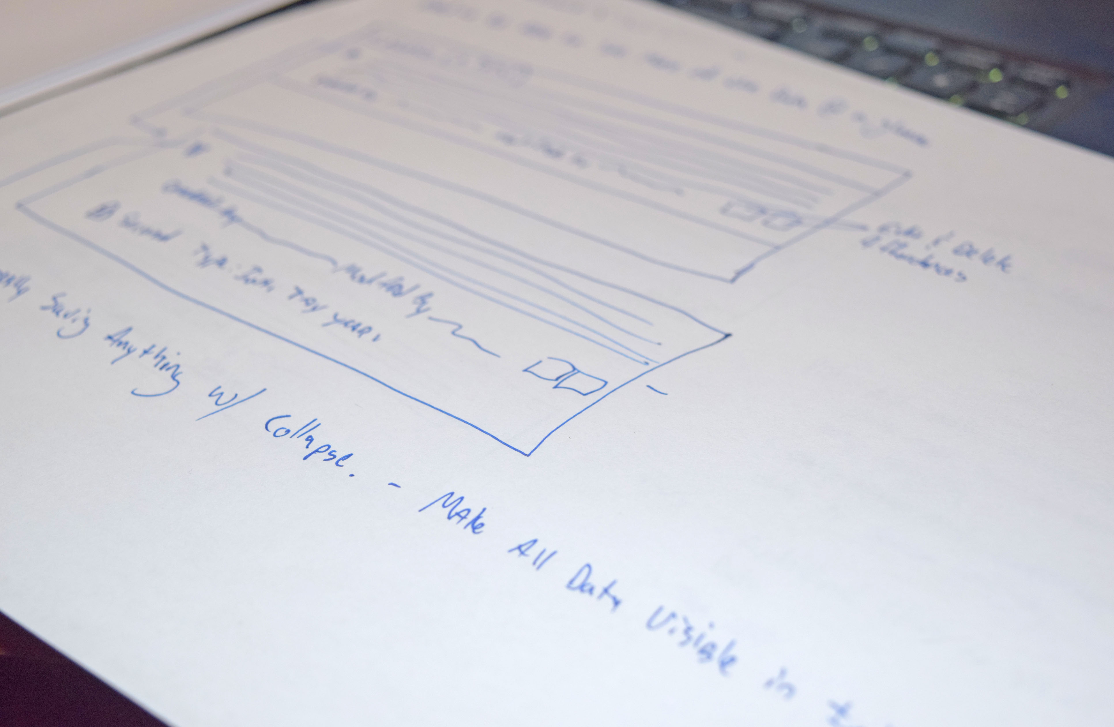
With the data gathered from the user testing I began to ideate solutions for the layout of the notes section that would allow easier comprehension by the user. I created a number of hand sketched low fidelity mock ups depicting potential solutions and met with the key stakeholders for feedback.
There were a few iterations to fine tune the comps to ensure they met both the business needs as well as addressing the user pain points.
High Fidelity Wireframes
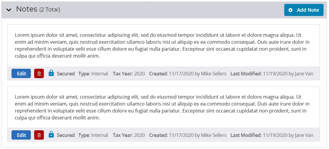
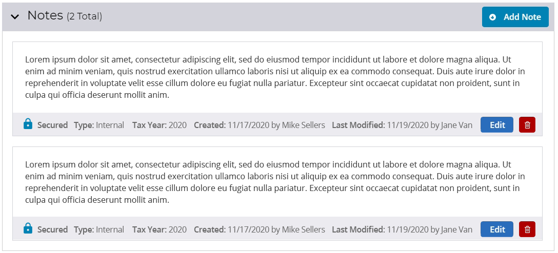
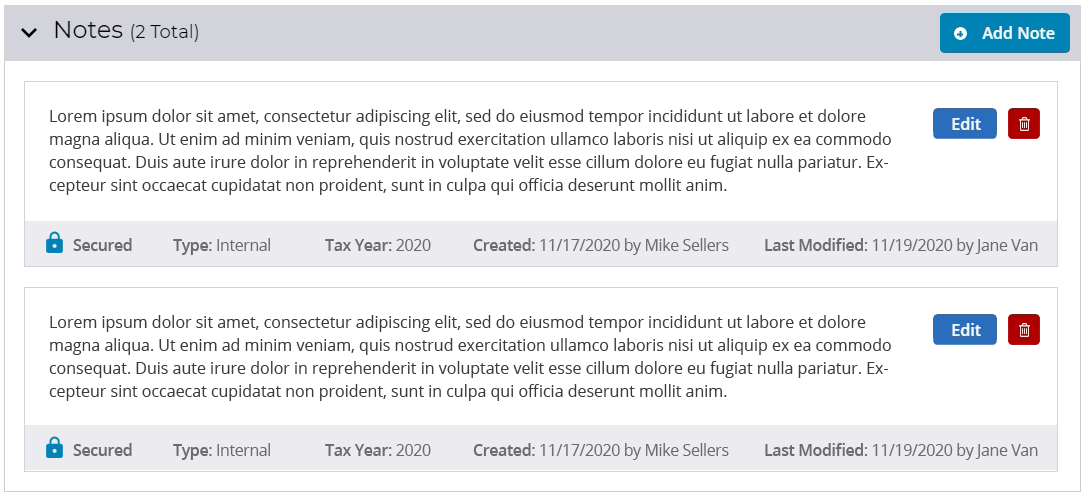
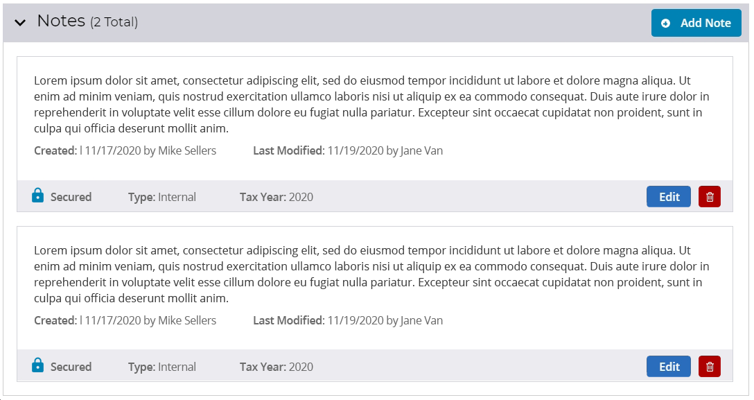
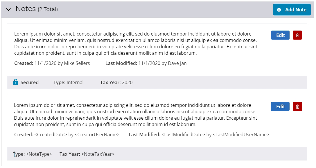
I focused on creating a design that would allow the user to see all of the note information at a glance without having to interact to access any note related data. Through the use of position and hierarchy the layout guides the user’s eye to the most important aspect of the function first; the note text.
The possible designs were created in Adobe XD which allowed me to include the different revised designs in comparative usability testing. Special attention was given to the impact of different button placement and element orientation and how those subtle changes impacted intuitiveness and data retrieval speed. As I narrowed in on a solution it became easier for the users to quickly process the content of the note while still being able to access all of the metadata.
A final layout was chosen and the prototype was iterated upon and tightened up.


